Procrastination
As school is starting up, I thought it would also be nice to give people the feeling of a normal school again as online classes seem to be affecting a lot of students.
Procrastination is my submission to the I Can't Write But Want To Tell A Story game jam.
The goal of which was to teach my daughter how to code and work with narrative elements while also immersing myself in the renpy engine once again. We entered this one in particular because the barrier for entry was so low.
So we discussed the different narrative elements. With over a month to prepare for this game jam with ideas, we went back and forth. Still, at the end of the day we found ourselves struggling to come up with story ideas we wanted to tell. We procrastinated. Which is where the idea for this game eventually came from.
While the game is playable in browser, it's not ideal unless you have speedy internet. A download is included below.
**Most recent build is 1.4
Fixed a image loading issue.
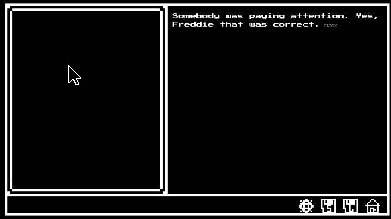
Added a smaller font version:
Screenshot of smaller font
Download
Install instructions
Unzip the folder and run .exe
There are 2 versions here. One at 16 font that was the original release and one at 12 font for those who would like it a bit smaller to glance at.
Development log
- Procrastination Behind the ScenesAug 11, 2020


Comments
Log in with itch.io to leave a comment.
AWEOSMMMEE GAME CANNOT WAIT FOR MORE! MUST INDULGE!
Another one, who’s Game Jam Submission page has vanished, rip
This is fun. I didn't expect the days to be so long, but then I fell into rhythm and after the third day everything passed in a breeze. Suddenly it's Friday and I don't want it to end! It's also amusing that the questions went farther and farther away from the seminar. That's... sort of how real life school is, sometime.
I like the aesthetics, down to the flashes before scene changes. The snippets of stories for each character, the idyllic home life (that isn't so idyllic afterall), and the small details included (definitely enjoying making different stuff each day, and the random events are fun surprises!).
I think you've accomplished something big here.
By the way, why is 'as tall as a tree' not a simile?
Whoops. Thanks for catching that. It is a simile, the code was just in the wrong spot. For those reading this who want to know why, it's because of the as.
"Similes directly compare two unlike things using like or as. (The bump on her head was as big as a watermelon.) Hyperbole is an exaggeration, doesn't use like or as, and is used to emphasize a point."
Sometimes you just go through the motions and forget why you labeled something something. Thank you for catching that! A new build is now up.
As for the kind words:
Well, thank you for the kind words. I spent a long time trying to make something that people could not only enjoy, but also try to find patterns through a replay. So you might not see all of Alan's story, but there is plenty of time to hang with Eugene. I have things for completionists and for those who just want to goof off. I tried to get as much of a system down as I could to at least make it enjoyable even if you don't know which route to take (like anyone picking the game up for the first time).
I loved the feel of this game. The music and art were perfectly in sync, and I really appreciated the aesthetic of a classical text game, which I think often gets lost in new engines.
The one thing that brought me out of it a little was the initial dissonance in answering most of the questions right during the first section and then being told that Freddie has bad grades - just an element that might be set up a little.
I wrote the ending the night before it was due between midnight and 4am so I can understand concerns about the way it ends. There are multiple endings depending on how you did in class so if you see Coach Cage, you did a good job in class.
Thanks for the comment. I'm trying to get better at doing this so these things really help.
I have to say, I liked the edition of the small font. My eyes aren't as they use to be, and it's been years since I played a game like this. I tried out both versions, and I have to say I'm liking the way the small font looks more. I had a issue with the music disappearing on me during the breakfast scene, but I couldn't replicate the issue so I'm thinking it was on my side.

I did run into another small issue:
A picture flashed of the teacher for a few seconds, and went black. This is day 2, Tuesday. English class. I was on this screen for a few minutes because I was writing down a note for the review. It's not something that is game breaking or even noticeable on usual game play, but all the same I felt I should tell you just in case it does become something.
I was honestly very surprised you did this in ren'py, it never crossed my mind it was possible to do old school games in that program, but I'm impressed. It shows experience in redoing the UI and front end.
It reminded me a lot about school. Freddie is just focusing on the day to day, and working with the different relationships around him. The disappointment of bad grades, not being able to reach someone, and the uncertainty of not know what to do.
(I tell you, I failed most of the questions off the bat, it made me slow down more and reread everything)
I really enjoyed it, I'm still playing it, trying out all the options and routes. I really want to see everyone's backstory and make Freddie do good. The fact you had all these options done, and this much different scenes is impressive.
My last suggestion is that the icons were hard to tell what they were. It took me awhile to realize it was a S and L, and that there was a options button, I just kept clicking esc key. I would set up a tutorial in the description or in game if you don't want to change your icons. Press right click to save, etc, etc.
Wonderful job though! I look forward to seeing what else you do!
I originally set the font at 14 which looked a lot similar to 12 than 16 does and I loved it so I agree that 12 looks better. I am keeping 16 up because that's what I entered it as but I hear the small text mode love which is why I made it and kept it.
I tried about 4 times but couldn't replicate the teacher pop on day 2 English. The reason I left it black on that screenshot was so I could remember when designing it that everything hid itself as a scene so it wouldn't do exactly what you are saying. The only thing I can think of is a weird delay with computer processing it or the base Renpy loading it slow (which is why it actually popped) because it should definitely be hidden before the question is even asked. What platform are you working with? I'm running windows so I have no idea if that's the cause.
As for the S L etc... It would have helped if I included the Help.txt file I created 3 weeks ago to put in to the folder when I made the distributions, wouldn't it? Thanks for reminding me to throw that in there. I've updated the game files with the help file that I should have remembered to put in there. I had a tricky time making the UI buttons the way I wanted them to look (the Options gear really does look like a snowflake) with the pixel style. I'll need to work more on making a better button configuration on the next game.
Thanks for the feedback.
Ooo, I didn't even think to look for a help.txt, so that one was on me for not checking.
It's possible that it was just on my side or Ren'py doing its own thing. I'm playing on windows, and I forgot that I did click out of the screen, so that could've caused the flash. I've seen weirder things happen when I minimize. But, I'm glad to see that it was just a issue on my end.
Honestly, I should've mentioned this with the review, but the fact that you got everything looking that cleanly was amazing. This type of pixel style( I wish I remembered how to call it.. 8 bit?) doesn't give you a huge amount of space to work with from experience, plus with only two colors you are under a harsher limit. The characters even had movement and emotions to them, which added to the appeal of seeing how they act.
The only last suggestions I have for the icons is to give them 1 or 2 more pixel space if possible. That way you can keep the original shapes, but the letters won't be attached and they won't be attached to the bottom. Or change them to simpler icons, though I would hate for you to have to do that because they do look pretty cool now that I know what they are.
Either way, now that players have the help guide, if you decide to keep them the same, they won't give the same trouble that I did.
I feel like I was the "user error" play-tester.
I appreciate you reading over the feedback and giving it some thought, even if you decide not to use any of it. Plus, I liked the feedback you gave me so I wanted to give the same respect back.
Feedbacks necessary at this stage of the game. I don't have a team to bounce stuff off of, it's just me and the kid who is pretty amazed at everything. We're all just doing our best in these jams to make an idea. I had some issues around day 4 with the pixel art until I implemented a few lines of code as Renpy doesn't work well with pixel art since it actually renders 3 screens (window, fullscreen and default). It kept coming out blurry until that happened. Next game I'll definitely look at a different button layout not just because of your suggestion, but I made the framework to be more flexible so I can change things around in the future.
This one worked and looked ok so I was content, but it really was a now let's move on kind of situation.
Again, thanks for the feedback as it helps me figure out where I need to improve. One of these days I want to get good enough to write the games I want to write (instead of working off meta concepts for these game jams). The only way I do that is by teaching myself new things and tackling new challenges so every bit of feedback really helps me figure out where the flaws are. Like I said, I had a help file that was supposed to be in there that I forgot about until you told me.
Hi, this was a great game, almost felt like school again, except with really good background music, (if only real life had that option). The story was really well-made, and the pixel art is good too. Every character had a backstory that was worth reading through, and I tried to get every achievement.
One problem in the game was that there was a menu choice error with Elle's path. On the third or fourth day/ interaction with her, it goes to the neighbor's route instead. I think that the text should be a little smaller, but that's just me.
Overall, a heartwarming story!
Found the bug! Patching it now. I had an event 4 for Elle on day 1 even though you can't reach it, but somehow I left it out of day 4 of all places where you would.
I've also included a Small Font version mode for people who need it.
Thank you for the feedback and helping me improve my game.
No problem at all!
nice game, It really felt like I was in school again :) My main criticism is that the lines of text seem to be too close to each other, especially when the first line and second line of text look to be only a pixel apart. Nice art + music :)
Thanks for the feedback. It really helps me look for things that I wouldn't normally see.